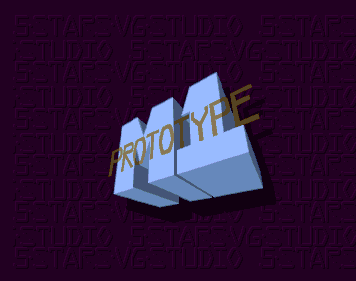
Looking for an Identity
Maltese proposed the name and logo of our team; since nobody had better ideas the name stuck. i later put the logo in the city level as billboard, cannot remember if is still there though. The name was Five Stars VG Studio; the logo was composed of five stars on the top, a big VG in the middle and below the remaining STUDIO text.

The Five Stars VG studio logo in a billboard on the city level
We also already started tests for the logo: beside the already shown Prototype logo, i started to design some alternate Powder logotypes. Keep in mind that at the time Psygnosis logotypes were quite trendy so i tried to create some following that style:


a first test for a Powder logotype in two colors


Another test for a Powder logotype: the second screenshot has guidelines for the coders in italian language in case they decided to animate it.
However those two early test were rejected, so back to the drawing board.
WolfSoft
So at the end of 1992 as explained in part 4 me and Maltese proposed Powder to with Mr.CornFlakes but he said was not interested in the game. In a latter time I tried to work with him in a recreation of the graphics for a clne of the World Rally arcade game by Gaelco; however, i underestimated the complexity of the map layout – that probably needed to be laid out in more than one layer.
I think have no surviving graphic files to show also because the work diskette malfunctioned at some point.
However, since at that time we were already in 1994, most of the computer gaming interest was starting shifting on PC; i remember Mr.CornFlakes showing me a preview of a 3D game based on a similar-robotech environment, also using timelapse animation of models for the introduction: indeed having a media like an Hard disk or even a CD-ROM was making a difference…
Consoles and Japanese Influence
The father of Maltese was used to go in eastern asia for business; once he came back with a good bunch of japanese computer mags; one was called Technopolis and was computer oriented; then there were a couple of PC-Engine related magazines.

Covers of the japanese computer mag Technopolis, courtesy of this page
Despite the language problems – at the time my japanese language knowledge was far lesser – those magazines gave us a deeper insight on japanese console games trendy at the time than my monthly purchase of local and british game magazines – especially CU Amiga and C+VG – could. So that showed me the most trendy shoot’em up in the console, like Rayxanber III, insight of Rayxanber II and other games.
There is also another friend of mine that is a diehard game collector and focused mainly on Amiga, megadrive and Super Nintendo, either the export machines or the official ones; therefore, not only via pictures in magazines but also live i was able to see lot of games in console, sometimes still in the japanese box with japanese handbooks and writings. The boxes and the writings, especially the japanese Megadrive game boxes, had for me – coming from art studies – their personality: the plastic case, the full color handbooks were giving me the feeling of a complete and solid product.
Plus the undeniable culture shock that manga culture provided on the western: albeit undercover during the eighties, it exploded as subculture in the early nineties and found me with my arms opened both as aspiring comic and animation designer, as video game graphic designer and as video game musician: the different (sometimes cheesy or plain weird for a western small town guy standards) tastes in graphic and music were opening me a new world, albeit not completely unknown for me: i knew a bit to use katakana since the eighties and extended that to learning more japanese language later on; now i can still use kanas and read some kanjis but am afraid is fading away (not good)…
An overview of the tools
The Map Editor is pretty simple. It is needed to load the MED source then write in the source code the path for the block files and the screens length of the map then use A to run the tool. There are two main screens: the first is the proper map screen and the secondis the seleciton screen. In the bottom there are twelve empty blocks. The user clock on several blocks of the map and then in the empty slot to “load” the block, then switches in the map screen and starts to “draw” clicking in one of the blocks in the palette below to draw that block. Through a button is possible to save the map and if i remember clearly pressing Escape to be quit back to the DOS.
The Enemy Editor – or eneditor – was also the main engine of the game. Modifying some flags was possible to compile either the editor version or the final version of the game, and using the parameters we were pointing the files to be loaded.
But, before of that, we needed to prepare the enemies with another tool, found by Tomas and Filippo, likely coming from the demoscene: seems to me to remember it was called RawEdit; however, we had to align all sprites animationone next to the other in a single picture to be then highlighted and saved in .bmap; i used to call those files MasterClipper.

An example of Masterclipper file for Ruins.
To insert an enemy in the eneditor was needed to scroll to the desired point then go to the selection screen. There was possible to choose one of the loaded enemies, define animations, behavior and other parameters. There was the possibility to create also nullObjects, mean empty sprites that were used to refer an enemy or an event. Through a number of selectors was possible to add counters for transformation either in raster cycles or in number of hits, plus there was the way to define parent-child relationships between enemy elements so that, in example of a boss we could have a nullObject that, in 300 raster lines transform in the boss – that have three linked objects shooting homing missiles and that transforms in explosions after 100 hits providing 20 credits. [need to find pictures for it] – other special events involved the passage of Sprites (for parallax effect) ,stopping the scroll and ending the level.
The intro, the screens and the ending that never were – almost
Is well known that Amiga did create the trend for fancy game intros thanks to psygnosis; might be less known that japanese games had text intros first and that the Neo Geo created the trend for cutboard lightweight intros.
Since powder was trying to retain an arcade or at least a console feel, I thought the cutboard style of intro was ideal. There are at least two attempts for me to create an intro for powder: the first one was supposed to have several vignettes in the foreground with cutscenes like the bay door opening, the ship igniting boosters and so on;
however, since was my own initiative was scrapped at the end, also because Maltese realized that i misinterpreted the M1 design (the dual tails are parallel, not slanted).

The second one was inspired by an animation work of Maltese that he presented at the 1992 edition of Bit.Movie, called 500 TL vs Ferrari, made with Deluxe Paint. It used 8 colors to use less memory but colors were good and so people not even noticed it. It placed at eight place.
That gave me some ideas that maybe using a similar approach i could create a small size anim file for the intro a la Psygnosis, and also helped me in do the jump towards making animated shorts.
Later in 1993 i made that animation participate to the Pixel Art Expo in Rome, where it placed – if i remember clearly – eighth too.
Powder from simone bernacchia on Vimeo.
Why at the end the animation did not come out despite the CD format? One of the reason is that we should need to split all sprites to be put into the eneditor and use that to animate, the second -and most important – one was that at the end we forgot of it.
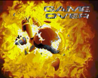
Among the countless open trenches that Powder – but not only – was leaving around, there were also other plans to embellish the game. Later in 1992 Agony came out and sported beautiful introductory screens for each level. Nobody asked me to, but i thought we could show those too in the game. So i started to work on Dpaint using half brite modes to create some of the introductory screens. The first to be created was the game over screen:
 The Game Over screen – sorry for the low quality since is taken from a video
Then i started also to work on the several levels, with mixed media, like in example Factory, was started from a screen grab of the opening sequence of “Blade Runner”; i worked on it a bit, pity the tape quality was bad…

And then the City Screen, done by hand, where i tried to use some daring perspective and reflections done by hand (was however later used in the game handbook cover)

Then the ruins main screen:

and the Clouds screen, unfinished, despite being probably the best one…

Also there was an attempt to do a game map, even this unfinished, but at just 32 colors:

I also was trying to find a good way to do the ending; one of my ideas was make the ship land in a carrier on the sea; i also made an ending song for it:
Music: Powder – End Game music (1992) [unreleased] from simone bernacchia on Vimeo.
At the end the final song has been replaced with the actual one, lightweight and included as different song in the main MOD file.
One thing that so far i forgot to mention is that at the time i did not had a monitor: all the graphics was made on my 1982 15″ Grundig Color TV plugged through RF modulator. Indeed was looking much better there (for gamers) than on a monitor screen, but instead Filippo, Nicola and Maltese had one so they were able to pinpoint when sometimes inaccuracies happened.
And other parts of the game started to take life. I was able to Factory, Space and Ruins soundtracks:
Music – Powder – Factory level music- 1992 from simone bernacchia on Vimeo.
Music: Powder – Ruins (1993) from simone bernacchia on Vimeo.
Music – Powder Space in-game soundtrack -v2 – 1992 (unreleased) from simone bernacchia on Vimeo.
And also the bosses idea started to take their place. First boss levels to be conceived were City and Space. For city the first idea was a giant armored ship that, however, due to color reduction did not looked too well:

So one day i decided to redesign it using the juxtaposed coloring and also giving a wink to Thunderforce: the result is a badass red flying carrier mothership shooting lasers from the front, with two openings where a red version of the city winged ships comes out and that needs to be destroyed in two phases.

Test rendering of the city boss
The background was then designed to be coherent with the game progress too, located in the huge hangar of the winged wtite ships, neatly stacked in floors.

A screen capture of an actual boss fight
Things were finally starting to make sense together and i was optimistic for Powder to see the light of day and for us to have a niche of work using our machines; unaware of the tragedy that was slowly unfolding in the other side of the ocean and that would at the end alter our lives…
…in WestChester,Pennsilvanya.


